Reshaped, Displaced, Erased.

Updated: Jul 15
Personal Practice in the Graphic Arts
How can book design be used to document and preserve London’s remaining 24 hour spaces?
Project Introduction
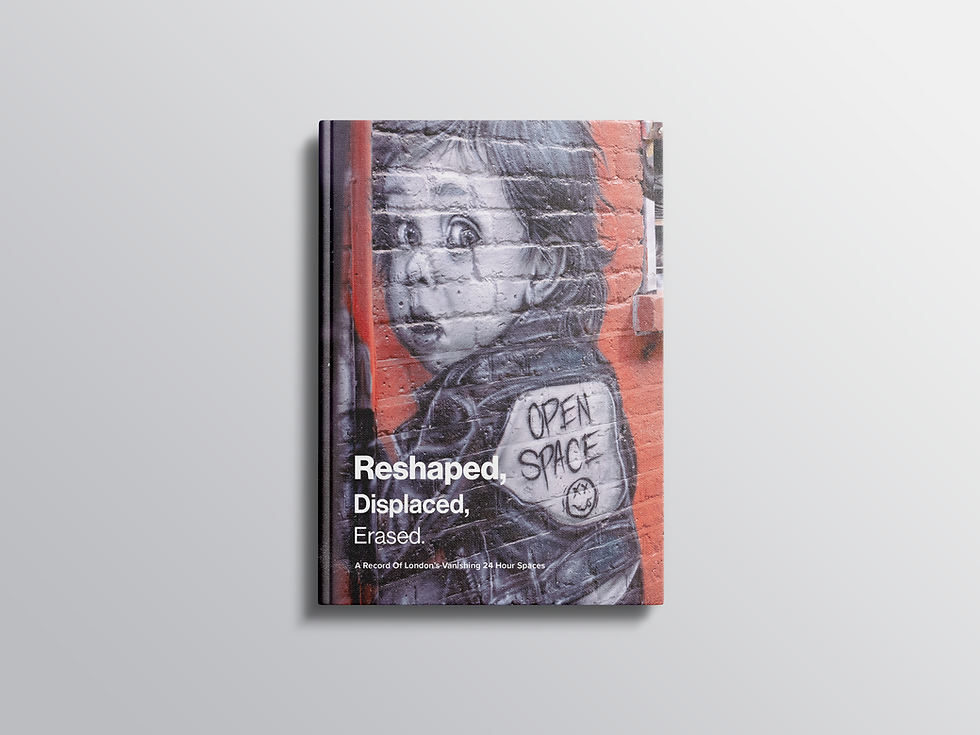
Reshaped, Displaced, Erased explores how book design can function as a public archive, documenting London’s remaining 24-hour spaces and preserving the stories they hold. Through photography and editorial design, the project celebrates the city’s continuous life and the communities that exist beyond conventional working hours. The work examines the effects of gentrification and redevelopment on these spaces, recognising that many have already been transformed or lost. Rather than simply recording London’s nightlife and late-night culture as they exist today, the project treats the book as a long-term repository of memory and place. By bringing together images, observations, and personal experiences, Reshaped, Displaced, Erased becomes both a celebration and a form of preservation. It asks how design can capture the identity of spaces that are constantly changing, and what it means to remember the buildings, communities, and everyday moments that once defined London’s continuous life. As time passes, the book may itself become a time capsule, offering future generations a glimpse into a city that has been continually reshaped, displaced, and erased.
Project Aims / Objectives
To summarise my intentions going into the module I have compiled my emerging aims for this project. The initial aim being to create a designed book that documents and preserves London’s remaining 24 hour / Late night community hubs. By producing a visual record and documenting these sites, my project seeks to create an archive of these spaces that are increasingly threatened by gentrification, redevelopment, and urban change. The chosen spaces / hubs that I will be documenting, will represent continuity and reliability within the city, with my key aim to focus more on recognition and documentation of the cultural impact. Moving away from the overall topic of my project, a secondary aim will be to explore how graphic design can communicate some more abstract concepts within these 24 hour spaces, such as accessibility, openness, and human connection. Typography, sequencing and layout will be treated as active design tool with a clear intention of influencing how the reader perceives the content, showing how these design decisions can evoke reassurance, rhythm, and familiarity that the spaces themselves provide. Finally my project will aim to challenge the dominant visual narratives of London at night. Rather than presenting night-time as dangerous or even chaotic, my work will seek to present the more overlooked stability.
What Is The Problem My Project Aims To Solve?
There are a few key aspects that my project aims to address. The first, and most important to me, is how book design can be used to publicly archive London’s remaining 24-hour spaces. The key phrase here is publicly archive, a concept that developed from my interest in how archives are generally perceived as spaces where historical or culturally significant documents are stored. They are not necessarily forgotten, but preserved, often hidden, and typically only accessed by a specific audience for a particular purpose.
My project aims to bring this archive of London’s 24-hour spaces, many of which are being lost through gentrification and the city’s rapidly changing urban environment—to the surface. By documenting and preserving these spaces within a book, I hope to make this archive publicly accessible to everyone. In doing so, the book acts as a time capsule, preserving spaces that hold cultural and historical significance within London’s communities. This is not to suggest that documenting London’s history through book design is a new concept. However, what I aim to communicate is the sense of consistency and stability that these spaces provide for so many people in London. They function as reliable landmarks and places that foster community, familiarity, and belonging. While this idea is central to the project, the book will also explore themes of erasure by visually representing how some of these spaces have become less inhabited than they once were as a result of gentrification. Through this contrast, the publication aims to highlight both the cultural value of these spaces and the gradual loss of London’s 24-hour identity.
Initial Research
At the start of this project, looking back into where my ideas came from and what inspired me, there was definitely a key focus around the concept of gentrification and archives. Gentrification is a topic, in a very general sense, that has always interested me. Living in cities like London and Bristol, which have always had such a historical and cultural tie to the past, always left me feeling a little saddened by how, as a society, we can have such little regard for these smaller spaces in cities, the real lived spaces that we inhabit every day, whether this be your local shop, a park where you go to sit and relax, or even a local pub. These spaces are slowly seeming to become less and less common, slowly being replaced by large offices and infrastructure. This is something I have seen firsthand in London and even in Bristol, where I have been living for the last decade. This is where my interest in archives played into building this concept of how I could publicly archive these spaces and display them for the world to see. Having taken trips to larger public archives like The Bristol Archive, I felt it was disappointing in a way to see so much of Bristol’s history stored away in boxes gathering dust and not necessarily seen again unless by a person with a very specific interest. As a book is something that we all use probably most days of our life, I wanted to see how I could use this vessel to build my own archive of the lived spaces that I have occupied. These spaces generally stood out to me as accessible spaces that are generally open 24 hours a day, and if not 24 hours a day, they are spaces that operate outside of the conventional hours. Thinking more along the lines of where do the office workers go after the 9-5 day has finished, where do the restaurants I love source their produce, and even where do those people that work in these spaces go outside of work? Having spent many years working in the hospitality sector, I often found myself navigating these spaces outside of the conventional hours, and they became to me safe spaces where anyone can congregate and carry on living life whilst the rest of the city carries on.

Why is this a topic that needs adressing?
Gentrification is reshaping London’s neighbourhoods at a rapid pace, altering not only who can afford to live in the city but also the public spaces and cultural venues that give each area its distinct identity. Independent pubs, family-run shops, local markets, community centres, cafés, music venues and bars often serve as places where communities gather, traditions are maintained, and local histories are shared. As property values and commercial rents increase, many of these spaces are forced to close, relocate, or be replaced by businesses that cater to wealthier, newer residents. While urban regeneration can bring investment and improved infrastructure, it can also erase the everyday landmarks that reflect a neighbourhood’s social and cultural heritage. This publication seeks to document these spaces before they disappear, creating a visual and written record of London’s evolving streets and communities. By preserving the stories and character of places at risk, the project highlights the importance of protecting not only buildings, but the relationships, memories, and sense of belonging that they foster.

What Were My Key Design Inspirations?
At the forefront of my mind whilst undertaking artist research and seeking design inspirations, there were many key influences for all aspects of my design work. However, a significant influence on the visual direction of this project was the work of Hoxton Mini Press. Their publications illustrate how a restrained and deliberate design approach can make printed content both engaging and highly accessible. Instead of relying on intricate layouts or excessive graphic elements, their books often employ consistent grids, ample white space, strong typographic hierarchy, and carefully curated imagery to prioritise the content. This minimalist approach results in publications that are calm, intuitive, and easy to navigate, encouraging readers to focus on the stories rather than being distracted by the design.
Hoxton Mini Press is particularly effective because it communicates personality through simplicity. Each publication explores a different topic, yet there is a recognisable visual consistency throughout their catalogue. Repeated layout structures, restrained colour palettes, and balanced page compositions create familiarity, allowing readers to quickly grasp how the information is organised. This consistency builds confidence, making the reading experience more approachable while maintaining a strong editorial identity. This design philosophy greatly influenced my own publication. Instead of creating a highly experimental layout, I opted for a repeated page structure that remains consistent throughout each chapter. While this might seem predictable, the repetition is intentional. It reduces the visual processing required as readers move through the book, enabling them to focus on the content rather than constantly interpreting new layouts. The result is a publication that feels steady and considered, reflecting the quiet observation central to the project.
Materials, Stock And Binding Methods
Whilst considering the materials that i would be using throuighout this project i wanted my book to not just be a physical object to display photography and text, but a bound document that actually embodies the spaces that i am portraying, maybe not in such a obvious sense but The physical design of Reshaped, Displaced, Erased was carefully considered to reinforce the themes explored throughout the publication. I chose to produce the book as a hardback, case-bound publication to symbolise the strength, permanence, and resilience that London’s 24-hour spaces have historically represented within their communities. Although many of these venues now face increasing pressure from gentrification, they remain culturally significant landmarks that have shaped the city’s identity for decades. In contrast, I selected a lighter, uncoated 120gsm paper stock to communicate the growing vulnerability of these spaces. The softer, more tactile material reflects the fragile position they now occupy, while its uncoated surface subtly mutes and softens the printed photography, creating a slightly faded quality that echoes the gradual disappearance of these environments from London’s urban landscape. I felt this combination of a durable exterior and a more delicate interior created a meaningful visual and tactile contrast, representing both the enduring legacy of these spaces and the uncertainty surrounding their future.

This is something I was feeling generally happy with as a concept and felt it was well reflected in the end design. Although as a design concept this was established early on, I did experiment with creating my book in a perfect bound soft cover format. This was something that I felt generally did have a well-finished professional look, but it really felt like something was missing. Having the intention set in stone that this book would be a one-off piece for an exhibition rather than a series to be mass-produced, a hardcover in a larger A4 format felt much more fitting and generally delivered a more hard-hitting impact once printed, something that I felt my topic deserved.
Photography research & Inspirations
Photography emerged as a crucial method for conveying the objectives of this project, serving not only to document London’s 24-hour spaces but also to preserve locations whose identities are being transformed by redevelopment and gentrification. During the research, I was drawn to photographers whose work serves both as documentary evidence and a historical archive. Instead of creating highly stylised images, their photographs depict ordinary streets, buildings, and public spaces that later become valuable records of cities in transition. This approach significantly influenced my own photography, prompting me to prioritise authenticity and observation over idealised representations of London.
Collectively, the following photographers shaped my approach to image-making throughout this project. Their work shows that documentary photography is not just about recording what exists but about recognising what may soon be lost. Inspired by their methods, my photographs aim to serve as an archive of London's 24-hour culture, preserving independent businesses, public spaces, and historic venues that continue to shape the city's identity. As gentrification alters London's physical and social landscape, these images become more than illustrations within a book; they become a record of a particular moment in the city's history, capturing spaces that future audiences may know only through documentation.
Eugène Atget
One of my earliest and most influential research projects focused on the work of Eugène Atget, whose photographs of Paris at the turn of the twentieth century documented streets, shopfronts, cafés, and public spaces before they disappeared due to modernisation. Although Atget did not originally intend for his photographs to be considered art, they have become a vital archive of a city in transition. His work highlights the importance of capturing everyday places that are often overlooked, as their cultural significance often becomes apparent only after they have changed or vanished. This concept directly inspired me to photograph London's independent cafés, pubs, markets, and public spaces as they exist today, creating a visual record that may become valuable as these environments continue to change.
Stephen Shore
Relating more directly to my project is the work of Stephen Shore, particularly his series documenting everyday life across America. Rather than focusing on iconic landmarks or dramatic events, Shore photographs ordinary streets, roadside architecture, shopfronts, and public spaces with a quiet observational approach. His work elevates the mundane, encouraging viewers to recognise the significance of places that might otherwise be overlooked. Through the use of colour and careful composition, he demonstrates how seemingly unremarkable environments can reveal the character and identity of a location. This perspective influenced my own approach to photographing Blackpool, encouraging me to document familiar streets and everyday spaces not because they are traditionally considered picturesque, but because they reflect the town’s lived experience and the communities that continue to shape its identity.
Nick Turpin
Another key influence when approaching this project was the work of Nick Turpin. Through his candid observations of everyday life in London, Turpin documents the rhythms of the city and the interactions that unfold within its public spaces. Rather than focusing on iconic landmarks or staged moments, his photographs capture commuters, cafés, buses, shopfronts, and streets, revealing how ordinary urban environments become meaningful through the people who inhabit them. His work demonstrates that documentary photography can preserve the character of a city by recording its everyday routines and the spaces that facilitate them. This perspective closely aligns with my publication, which seeks to document London’s 24-hour spaces as lived environments, capturing the people and places that define the city’s continuous activity before these spaces are altered by redevelopment, changing patterns of use, or gentrification.
Typographic Design Choices
One of the stages that felt particularly important to me was my consideration of typography and how I would be using this in my final design. I have already spoken a little on how I made conscious decisions to keep my typographic choice and use of text as consistent as possible, to aid in my audience’s reading experience and keep the book as structured as possible. This is something I felt tied in largely with my use of typography and why I chose to use fonts such as Proxima Nova and Neue Haas Grotesk. Both these fonts are well known for their readability and well-composed, clearly spaced characters. For me, these two fonts felt like the most clear choices to move forward with, having experimented with type choices a little more directly and historically related to London, such as ‘P22 Underground’ or ‘Gill Sans.’ These typefaces felt very appropriate in terms of representation and reflecting the history and character of London as a city; however, I found the spacing and structure of typefaces like this did not hold the same level of clarity as I had previously been looking for. A large part of my design choices around typography also played into the versatility of Proxima Nova and Neue Haas Grotesk, both typefaces having multiple forms ranging from ultra-light to bold, meant that I had so much more range here to keep a clean visual balance whilst still being able to use type to represent hierarchy, structure, and pacing throughout each chapter.
Photographic Choices And Development
When considering my own photographic style, I wanted to draw heavily on the inspirations I had previously identified in the work of John Claridge, Charles Marville, and Eugène Atget. At the same time, I found myself influenced by Martin Parr. Although Parr may seem like an obvious photographic reference, it is his attention to the smaller, often overlooked details that I found most compelling. His ability to notice everyday objects that easily blend into the background and bring them to the forefront of his photography resonated with me. In many ways, this reflects the central theme of my book: giving visibility to places and objects that have become lost or overlooked, allowing them to become the focus of attention once again.
I feel that I combined these influences throughout my book by merging the documentary qualities present in the work of Claridge, Marville, and Atget with Parr’s emphasis on the lived details of everyday environments. This approach enabled me to highlight both the character of my chosen 24-hour spaces and the ongoing processes of gentrification and the erasure of the communities and histories embedded within them. I also sought to communicate these ideas through a varied photographic approach. Some images focus on the architecture of the spaces, documenting their physical form, while others emphasise their use, or lack of use by the people who occupy them.
The photographs featuring people inhabiting these spaces often suggest that they remain active and valued within the community, perhaps indicating that they have been less affected by gentrification. In contrast, the images of empty spaces place greater emphasis on the architecture itself, attempting to capture the feeling that these locations have become shells of what they once were. Through this contrast, I aimed to explore the relationship between people, place, and the gradual transformation of urban environments.
Visual Challenges And Representation
This stage of the project was arguably one of the most challenging, as it pushed my photographic practice beyond my comfort zone and encouraged me to experiment with approaches that I had not previously explored in such depth. From the beginning of my master's degree, one of my primary intentions was not only to develop my portfolio but also to challenge myself creatively and technically. This project became an opportunity to fulfil that ambition by testing both my photographic abilities and my confidence as a practitioner.
One of the greatest challenges throughout the project was navigating my chosen spaces and determining how best to photograph them. Many of the locations were visited repeatedly over 24 hours across the course of two weeks. This allowed me to experience each space at different times of day and night, helping me identify when it was visually at its most compelling and when its story could be most effectively communicated through photography.

This became particularly evident when comparing different locations. Spaces such as Outernet in London remained consistently busy throughout the day and night, and this constant occupation became an important aspect of my documentation. However, photographing these environments presented its own challenges. As the people within the images were members of the public rather than posed subjects, creating visually engaging compositions required patience, careful observation, and the ability to seize fleeting moments. Rather than producing photographs that felt overcrowded or poorly composed, I aimed to capture images that balanced the energy of the space with thoughtful framing and visual clarity. In contrast, locations such as Smithfield Market presented a very different set of photographic opportunities. As a site increasingly affected by gentrification and ongoing uncertainty surrounding its future, it felt more meaningful to document its quieter moments rather than its busiest trading hours. During the day, when the market is closed, there are few visual indications of its historic purpose. Instead, the space resembles little more than an underpass, with only the occasional worker remaining to clean away the lingering traces of the night's activity. Photographing the market in these quieter periods allowed me to emphasise the sense of absence and transition, reinforcing broader themes of change, decline, and the gradual erasure of spaces that once played a vital role in London's everyday life.
Editing, Curation, and Visual Cohesion
The challenges of this project did not end once the photographs had been taken. In many ways, the editing process proved to be one of the most demanding stages, but it was also where I developed new technical skills and overcame some of the project's most complex problems. As the photographs had been captured across multiple days, at different times, and under constantly changing weather and lighting conditions, I was left with a body of work that varied significantly in its visual appearance. Although the images documented the same locations, they initially lacked a cohesive visual identity that connected them as a single photographic series.
As a result, I spent considerably more time editing than I had originally anticipated. Using a Canon D750, I imported and developed the photographs in Adobe Lightroom, beginning by removing unsuccessful images and duplicates before refining the remaining selection. From there, I carefully adjusted elements such as exposure, contrast, clarity, white balance, and tonal range to create greater consistency throughout the series. This process involved reviewing each image individually while also considering how it functioned alongside the rest of the collection. I aimed to establish a unified visual language so that the photographs felt connected, despite having been captured under different conditions over an extended period.
While I believe this editing process was ultimately successful, it also required several difficult decisions. There were many occasions where I had to evaluate whether an image genuinely contributed to the overall narrative of the project or whether I was simply drawn to it because it was visually striking. This became an important turning point in my editing process, as I realised that selecting photographs based on their conceptual relevance was far more valuable than choosing images solely for their aesthetic qualities. Prioritising photographs that best communicated the themes of memory, change, and gentrification strengthened the coherence of the final body of work and ensured that every image contributed meaningfully to the project's overall narrative.
Photographic Experimentation
A significant part of this project that I feel is important to discuss is what went wrong during my editing process. Initially, I felt that my photography alone was not as strong as it could have been, so I decided to take my images into Adobe Photoshop for further editing.
Looking back, I think this is where I began to overwork some of the photographs. I experimented with applying filters, grain, and other effects in an attempt to create a more weathered, forgotten aesthetic. At first, I felt these edits were successful, as they reinforced the concept of these spaces gradually being erased over time. The distressed appearance helped communicate the idea of places being abandoned, overlooked, and slowly disappearing from memory. However, once I placed the edited photographs into my final Adobe InDesign publication, it became increasingly clear that the effects were reducing the overall quality and impact of the images. The heavy editing caused many of the photographs to lose detail, contrast, and clarity. It wasn’t until I printed a physical copy of the book that I fully realised these edits were not supporting the project in the way I had intended. Seeing the work in print made it obvious that the original photographs were much stronger without the excessive post-processing. Despite this, I still felt that many of the photographs were well composed and worked effectively as standalone images. Rather than discarding them, I decided to develop a separate miniature publication in the form of a photo flipbook. My intention was for this to act as a takeaway piece for visitors to the exhibition after viewing the main publication. Rather than providing the same level of detail as the book, the flipbook captures the atmosphere and essence of the project in a much more concise format, functioning almost like an artistic business card that encourages further exploration of the work.
Final Outcomes
Having produced numerous test copies of my book throughout the project, I felt confident that I was ready to move on to the final print stage. The testing process gave me reassurance that the publication would print to a high standard and significantly reduced the likelihood of major issues arising during production.
For the final version, I chose to outsource the printing and binding to a professional print company. Although this meant I was less directly involved in the physical production of the book, I initially worried that the finished publication might feel less personal than if I had hand-bound and stitched it myself. However, I ultimately decided that achieving the highest possible production quality was more important. As this publication was intended to be the final outcome of my project and a key exhibition piece, I wanted every aspect of it to feel polished, professional, and carefully considered. Working with an external printer also became an invaluable learning experience. Throughout the process, I developed a much greater understanding of professional print production, from discussing specifications and selecting materials to preparing files for print and communicating remotely with a commercial printer. These are skills that I believe will be highly valuable in my future practice as a graphic designer, providing me with first-hand experience of managing a print project fromplanning through to production. Despite the extensive testing, the final print process still presented several unexpected challenges. Although I followed the same workflow that I had used for my test copies, several seemingly minor changes had a much greater impact on the finished book than I had anticipated. Small adjustments to the tone of black used throughout the publication, alongside subtle refinements to the positioning of images and text, affected the balance of several spreads once printed at full quality.

As a result, I had to revisit my Adobe InDesign document and make further layout adjustments before resubmitting the files for printing. There were also a small number of production issues on the printer’s side, which resulted in ongoing communication to resolve the problems and negotiate reprints and associated costs. Although these setbacks delayed the final production process, they reinforced the importance of careful quality control and clear communication when working with external manufacturers. Experiencing these challenges has given me a far more realistic understanding of professional print production and has prepared me for managing similar projects in the future.
Book Content Development
One of the final aspects of the project that is important to reflect on is the written content of the publication. Overall, this is an area that I am particularly pleased with, as I feel the content successfully supports both the visual design and the intentions of my research. While there are still elements that I would refine if given more time, I believe the overall structure effectively communicates the narrative of the project. Each chapter follows a consistent framework built around four key themes. It begins with an introduction to the space, providing a brief history and exploring the qualities that make it culturally or socially significant. The reader is then introduced to what everyday life within that space is like, considering the communities that inhabit it and the role it plays within the surrounding area. From there, the content expands to examine the space’s place within London’s wider 24-hour culture. Whether the location remains active throughout the day and night or functions as a place of safety, community, or public interaction, this section explores its wider significance beyond simply being open at all hours.
Each chapter concludes by looking towards the future of the space, reflecting on the impact of regeneration, redevelopment, and gentrification. This final section asks whether these places are likely to survive for future generations or whether they will gradually disappear, leaving this publication as a record of something that once existed. Ending each chapter in this way reinforces the central aim of the project: to publicly archive London’s remaining 24-hour spaces before they are permanently transformed or lost. I feel that the pacing and structure of the written content work particularly well alongside the photography. Rather than competing with the imagery, the text provides context that allows readers to engage more deeply with each location and develop a greater understanding of its atmosphere, history, and cultural importance. Together, the photographs and written narratives encourage readers to immerse themselves in these urban environments and consider why they deserve to be remembered and preserved.
The written content evolved considerably throughout the project. My initial draft approached the publication more like a guidebook, encouraging readers to visit the featured locations. However, I eventually realised that this direction weakened the core concept of preservation and public archiving established by my research question. By reframing the publication as a documentary record rather than a visitor’s guide, I believe the book more effectively responds to my research question: How can book design be used to publicly archive London’s remaining 24-hour spaces? This shift in approach strengthened both the narrative and the purpose of the publication, allowing the outcome to function as both a design artefact and a lasting archive of spaces that continue to shape London’s identity.
Project Conclusion
Reflecting on this project as a whole, I am extremely pleased with both my outcomes and the planning that went into the exhibition. While the project certainly presented several challenges throughout its development, it also allowed me to achieve the key personal goals I established at the outset.
The first of these goals was to strengthen my portfolio and further establish myself as a thoughtful and research-led graphic designer. Throughout my MA in Design Communication, I believe I have developed a body of work that is well considered, visually coherent, and underpinned by thorough research. This project, in particular, has enabled me to refine my own visual language and further define my identity as a designer. My second goal was to challenge myself by exploring areas of design that I had little or no previous experience in. Photography became one of the most rewarding aspects of this project, offering a highly personal way of documenting and communicating the world around me. It allowed me to capture everyday moments through my own perspective and present them in a meaningful way. Although photography was initially outside of my comfort zone, I have developed considerably throughout the project. I progressed from simply understanding how to operate a camera to gaining confidence in manual camera settings, composition, visual storytelling, and post-production using Adobe Lightroom. These new skills have significantly broadened my creative practice and provided me with another medium through which I can communicate ideas. My third and final goal was to undertake a project closely aligned with the area of graphic design that I hope to pursue professionally. Editorial design has always been an area of particular interest to me, yet I had never previously designed a publication from concept through to completion. This project allowed me to fully immerse myself in every stage of the editorial design process, from research and photography to sequencing, typography, layout, production, and print. Seeing the publication evolve from an initial concept into a professionally produced book has been one of the most rewarding aspects of my MA, and is something I take great pride in. More broadly, and in relation to this module as a whole, my primary objective was to respond to the research question: How can book design be used to publicly archive London’s remaining 24-hour spaces? I believe the publication successfully addresses this question by documenting a selection of these spaces before they are further altered through redevelopment and gentrification. The combination of photography, editorial design, and written context creates a lasting record of locations that continue to contribute to London’s identity but are becoming increasingly vulnerable to change. At the same time, I recognise that this is an incredibly broad subject. London’s 24-hour culture is constantly evolving, meaning this publication represents only one chapter within a much larger ongoing archive. In many ways, the project could continue indefinitely as new spaces emerge while others disappear.
Editorial design, and written context creates a lasting record of locations that continue to contribute to London’s identity but are becoming increasingly vulnerable to change. At the same time, I recognise that this is an incredibly broad subject. London’s 24-hour culture is constantly evolving, meaning this publication represents only one chapter within a much larger ongoing archive. In many ways, the project could continue indefinitely as new spaces emerge while others disappear.
Looking back, there are several aspects that I would approach differently if I were to undertake this project again. With the experience and knowledge I have gained, I would reconsider how I documented these environments. While I enjoyed adopting the perspective of a silent observer, capturing the spaces as though simply passing through them, I think it would be interesting to introduce a more personal dimension to the work. Including more of the people who inhabit these spaces could offer a richer representation of London’s 24-hour culture and further emphasise the relationship between people and place. My decision to photograph many locations during quieter moments was intentional, reinforcing the themes of preservation and the gradual effects of gentrification. However, balancing these quieter scenes with more images of human interaction may have provided an additional layer of narrative, documenting not only the physical spaces themselves but also the communities and routines that give them life.
Overall, this project has significantly expanded both my technical abilities and my understanding of research-led design practice. It has strengthened my confidence across editorial design, photography, exhibition design, and publication production, while reinforcing my belief in the role that graphic design can play in documenting, preserving, and communicating cultural narratives. More importantly, it has confirmed my desire to pursue editorial and publication design professionally, providing me with a substantial body of work that reflects both my interests and my aspirations as a designer.

Comments