Portfolio project 1: Inventory

Imagining Contemporary Practice in the Graphic Arts
Objective & Outcome
Your challenge in this project is to take a personal inventory. You can choose to focus on anything that is connected to you — physical, material, environmental, thought or sensed. You will need to present the inventory in the form of a printed A1 poster. The final A1poster must include a title, the content of your inventory and your name.
Defining my personal inventory
What is a personal inventory? What defines me in terms of:
Objects / Possessions / Thoughts / Feelings / Interests / Hobbies / Characteristics?

Exploring identity: A mind map titled "Who is Charlie" visually breaks down the elements of personal identity, categorising thoughts, feelings, objects, possessions, interests, hobbies, and characteristics. Each branch highlights aspects like emotions, ambitions, and hobbies, offering a comprehensive look at personal inventory and self-understanding.
Initial concepts
What I carry (Whats in my pocket / Emotions / Burdens)
Daily rituals (Morning coffee / Running / Music)
Running (Marathon training / Locations / People / Weather / Miles)
Tattoos (What each one means & What this says about me)
Music (Artists / Albums / Mood & Feelings)
Physical features (Eye colour / Hair colour / Height / Weight)
Collecting data / Understanding personal inventory
Methods of data collection:
Drawings / Sketches
Videos / Photos
Graphs / Charts / Tables
Sound recordings
Research taken from information is beautiful showing a collection of data around people daily diets. I also found the concept here of displaying this information in a graph/chart interesting.
Initial research & reading
Digital design theory: Has been instrumental in enhancing my understanding of typography's significance and its application in my designs. It has also provided me with intriguing insights into layout and multimedia, which will be essential in creating my final A1 poster.
Armstrong, H. (2016). Digital design theory : readings from the field. New York, New York: Princeton Architectural Press.
Sketch Your World: Provided me with valuable insights into the concept of journaling. It demonstrates how effectively capturing what may seem like mundane daily activities or objects in a straightforward manner can convey a snapshot in time.
Sekimoto, K. (2022). Sketch Your World. Tuttle Publishing.
Information is Beautiful: Significantly influenced my initial research for this project. In exploring the idea of maintaining an inventory, Information is Beautiful demonstrates how data and information can be categorised and prioritised before being presented in a playful yet thoughtful manner. The concept of recording data through charts and graphs is something I would like to explore further, as I believe this is a clear and engaging way to track my findings.
Mccandless, D. (2012). Information is beautiful. London: William Collins.
Exploring data collection
Exploring personal inventory: Creating sketches and vectors of my tattoos, exploring keeping an inventory of each tattoo and thinking about what this says about me or what was happening in this stage of my life.
By recording recurring items throughout my week, I can understand which material possessions could contribute to a personal inventory.
Exploring Personal Inventory: Documenting a daily record of the personal items I carry each day through photography.
Exploring personal inventory: Capturing a daily log of my coffee experiences through photography in a journal.
Presenting my data: Here I explored the idea of tracking an inventory of one of my daily routines. Each day begins with a cup of coffee, regardless of the time, place, or plan. This provides insight into my daily habits and routines. The idea of using bar charts or graphs caught my attention while reading "Information is Beautiful," drawing inspiration from Lakesh Dhakar.
Collecting data through screen recording:
Music plays a significant role in my daily life. With this in mind, I have recorded short video snippets of what I was listening to, and the second image represents how I felt at that moment.
Presenting my data: I explored different methods to present the data I gathered through video recordings. Instead of concentrating on the videos as the collected data, I decided to emphasise the mood I experienced while listening to the songs and how this could be represented in the future.
Establishing my design intentions
As I aimed to advance my project, I wanted to ensure it remained as personal and focused on myself as possible. Through my research, I have learned a great deal about myself, particularly from documenting the objects I carry. This process prompted me to reflect on why each item accompanies me daily, what it represents, and how my day would unfold without it. For instance, a significant insight for me was that my iPhone accompanies me everywhere; not a day passes without it in my hand. To me, this goes beyond a mere material object and symbolises connection and coordination, serving as my link to people, plans, and ideas. It is both my notebook and my compass. Always in hand, always on.
Moving forward, my plan is to centre my project around "An Inventory of Me," exploring what defines Charlie. I'll examine the objects I carry and the reasons behind them, as well as the key physical features that make me who I am. While the topic is broad, I believe it provides a profound exploration into the idea of a personal inventory and offers a detailed glimpse into my life.
Exploring the concept of blueprints
![Houseidea, Inc (2024) House Blueprint [Blueprint design]. houseidea.com (2024) houseidea.com [online] Available at: https://www.houseidea.com/blog/exploring-different-blueprints-for-my-house/ [Accessed 27 Oct. 2025].](https://static.wixstatic.com/media/833ec1_645dbf5d76a64f34b25db49e6e37ba13~mv2.jpeg/v1/fill/w_980,h_669,al_c,q_85,usm_0.66_1.00_0.01,enc_avif,quality_auto/833ec1_645dbf5d76a64f34b25db49e6e37ba13~mv2.jpeg)
Examining blueprints and the way architects and engineers frequently utilise them to clearly and systematically present their concepts. Blueprints are typically employed to communicate ideas in an organised and structured manner, which I believe is essential for effective communication of ideas.
As I consider how these can be applied to my future work, I have had the idea of experimenting with creating a personal blueprint that outlines an inventory of my physical characteristics.
Further research into blueprints | Clive Kirk
Kirk, C. (July 17th 2013) Musica Blueprints [Blueprint illustrations]. Behance.net. (2025). Behance.
[online] Available at: https://www.behance.net/gallery/9876821/Musica-Blueprints [Accessed 27 Oct. 2025].
While exploring the concept of blueprints and how they can be used to convey ideas, I examined designer Clive Kirk, who has created a series of blueprints of everyday objects and items that interest him. I found this particularly intriguing as I was in the process of designing some initial drafts for creating a personal blueprint of myself and my life. To connect this idea to the concept of a personal inventory, I considered what defines me and what items I could include around this concept in a similar way, rather than just focusing on taking an inventory of the physical features that define me. This is something I would like to explore in more detail later in the project.
Initial design ideas
While developing my initial sketches for a personal blueprint, I drew significant inspiration from 'Sketch My World,' intentionally keeping my sketches simple. My initial thoughts were that a blueprint typically contains a lot of data, so although the images would be a focal point, I wanted to find a way to avoid overcomplicating the design and making the final product feel cluttered. I also appreciate the contrast between the structured, methodical layout of the blueprint and the creative sketch style, which I feel represents me well—methodical and structured, with a creative flair.

Presenting my research / Initial concept
A brief 5-minute presentation was delivered to the MA Design Communications group, outlining my initial ideas, research, and the direction I intended to take with my designs.
Exploring Typography
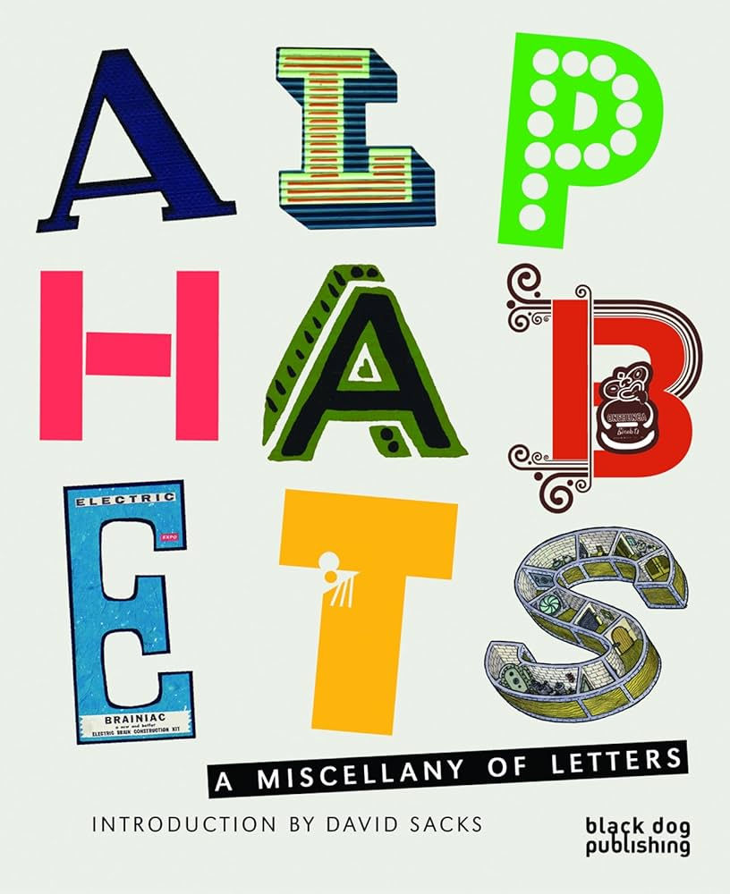
Before developing any typography for my final design, I wanted to research various typefaces that could be incorporated into my designs. The key consideration for me when integrating typography is ensuring that the intended message remains central to my focus. With the concept of a blueprint already well established in my mind, I wanted to explore its purpose: Is it to communicate fine details or to break down a complex item, such as a house or product?
Alphabets | A miscellany of letters truly helped me understand how much can be communicated through text, drawing particular inspiration from Ben Eine's series Shutters, 2002 - 2007.
I felt a connection with this series and loved the concept of taking a simple typeface and creating something captivating and beautiful by adding depth through the textures and surfaces you work on. At this stage, I would like to consider incorporating this into my designs, perhaps by using surfaces like blueprint-textured paper to add depth to my typography.
Shutters | Ben Eine | 2002 - 2007
Sacks, D. (2010). Alphabets : a miscellany of letters. London: Black Dog Publishing.
Introducing Typography to my work
In exploring typography and its potential integration into my designs, I reflected on what is commonly found in a blueprint and how this aligns with my personality. Having already considered both the methodical and creative aspects of my character, I aimed to see how structured, uniform fonts like Helvetica and Monaco could fit into my work.
While these typefaces are sometimes seen as dull and safe, I find them unparalleled for communication. They are clear and prioritise conveying information over style, akin to the purpose of a blueprint in detailing essential information. To infuse a personal touch into my designs, I examined how typefaces like Homecoming and Notepad could be utilised to diversify the designs. Incorporating a note-taking element is significant to me, as it illustrates that, despite the methodical and structured nature of my designs, I am continually refining and adding details until the very end.
Experimenting with poster titles
When creating typography for my final design, I aimed for something simple and structured, like the Bold Helvetica typeface above. Due to its simplicity, I find this typeface ideal for clear communication. My goal was to modify the font to be bolder and hollow in the middle, allowing me to add my own texture to the interior, inspired by Ben Eine's series Shutters, 2002 - 2007. By merging the two, I believe I've crafted a bold and eye-catching title that conveys the main message of my final poster, while still maintaining a creative flair that enhances the illusion of notes being jotted down on the page.
Initial design idea
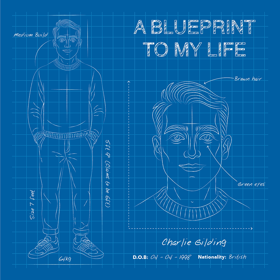
Development of my ideas
After solidifying my ideas and deciding on the style I wanted to pursue for my final design, I aimed to experiment by taking stock of some personal material objects that contribute to my identity.
After cataloging common objects in my life, I chose a few significant recurring items or those I found most meaningful to create sketches. I drew inspiration from Clive Kirk, working in the Sketch my World style. At this point, I aimed to keep the design simple, as I intended to transform these into a type of collage paired with text and wanted to avoid overcomplicating the designs. At this stage, I took my original sketches and developed them into hand-drawn vectors in Adobe Illustrator, later layering the designs over a blueprint-style background to ensure the final vectors stood out as independent images.
Group feedback and concept development
During this group session, we showcased our initial experimentation and design work to the rest of the MA design group. The feedback I received was generally constructive and assisted me in solidifying my ideas. Although I felt confident in the style and direction of my designs, the feedback indicated that the typography I was using was somewhat safe and could be developed further. This prompted me to explore how I could adapt and use typography differently to add a new level to my designs.
A1 Poster development
To enhance my designs, I aimed to experiment with assembling them and exploring the most effective layout. I drew significant inspiration from digital design theory, focusing on how the design would be read and navigated rather than viewing it as a static visual piece. Therefore, I made my typographic and layout choices based on the content's readability and navigation. I was particularly drawn to the idea of centring the poster around myself, as my inventory essentially revolves around me. While I was quite satisfied with my initial drafts, I felt the designs seemed somewhat static. This indicated that I could experiment further with layering and typography to make the poster more dynamic.
Reintroducing charts & graphs
The most significant feedback I received regarding my initial designs was that I left the general concept of inventory too vague, making it unclear what exactly the inventory consisted of. To clarify this concept, I revisited my initial idea of using charts and graphs. Having researched this approach earlier in the project while reading "Information is Beautiful," I felt that it could be a highly effective way to ensure my ideas were clearly communicated to the audience, leaving no doubt about what was being conveyed in my designs. This is something I aimed to integrate into my designs before proceeding to develop my final piece.
Layout and further design development
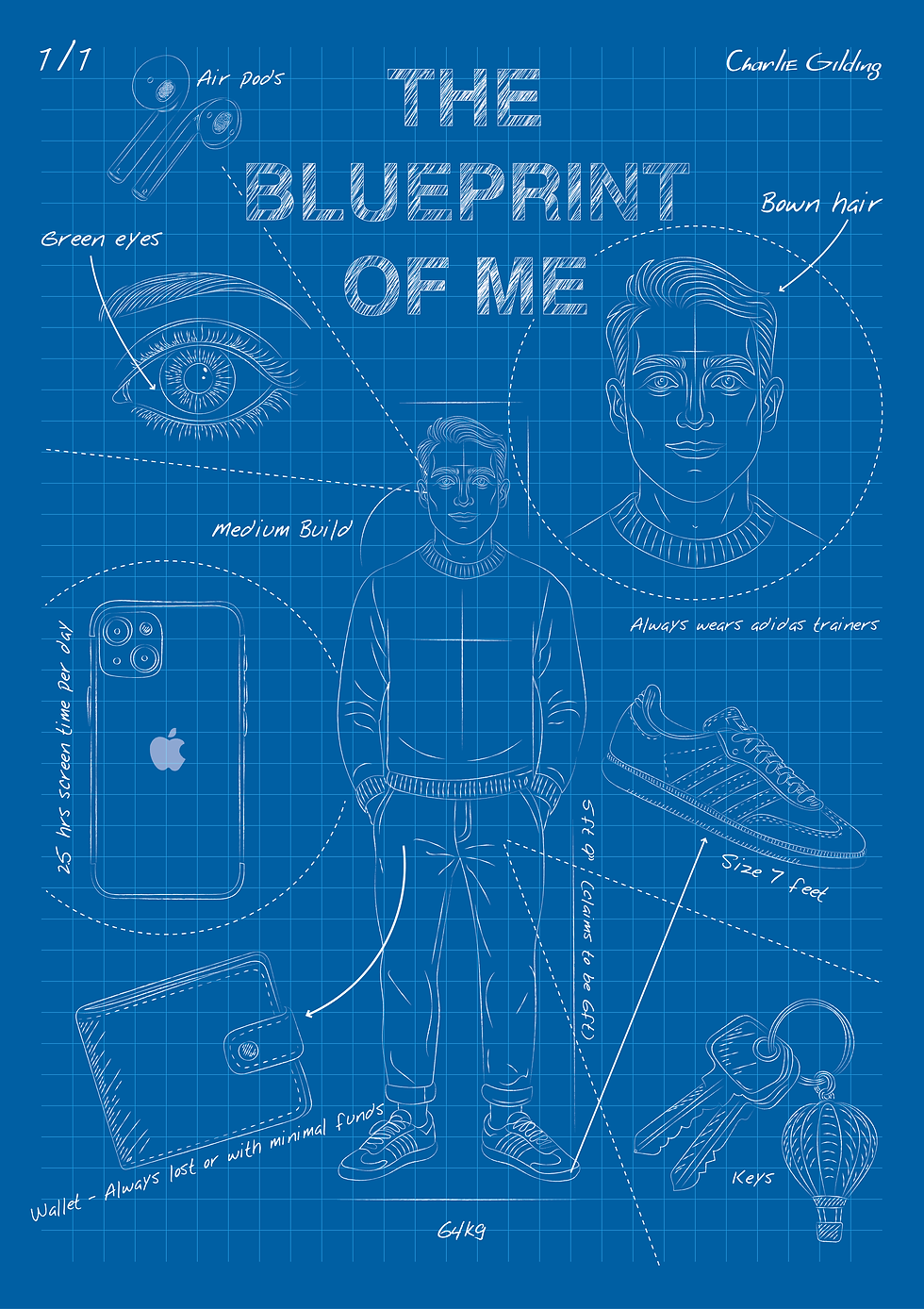
Considering the feedback from our group session, I realised there were aspects of my design I was satisfied with and others that definitely needed further development. The designs shown here experimented with both the layout and presentation of my ideas, utilising InDesign with grids to provide a clear structure. I believe that in a blueprint, everything should be meticulously laid out, down to the smallest detail. The image to the left shows what will essentially become the final design layout for my poster. Although this will be adjusted in the future to incorporate additional elements, I felt that this layout worked best. It is built around an illustration of myself, displaying an ascending arrangement of items that are important to me, from the most important at the top to the least important at the bottom.
After finalising the desired layout for my illustrations and the main content of my poster, I found it quite challenging to integrate this with the inventory data I had previously represented in graphs and charts. Although I had created these bright graphs to ensure they were visible and easy to read on the poster, they detracted from the overall design, resulting in a cluttered and underdeveloped final product. This is definitely something I will revisit to see if I can redesign my charts and graphs to create a more visually appealing result that aligns with the blueprint theme.
Further Typography research

While exploring the development of typography in my design, I discovered a work by Jamie Hearn. Jamie Hearn, a design student from Central St Martins, has created a typeface from a cohesive set of assembly components and designed a poster as a tribute to Jan Tschichold's 'Die Neue Typographie'. I was captivated by the concept of assembling type in an organised structural manner, treating the typeface components as elements that could be pieced together. This is definitely something I would like to incorporate into my work. Although I believe the 3D assembled block style may not suit my final design, it inspired me to further explore a 2D style typeface that exhibits the same level of structure and detail but maybe in a way that shows more mathematical elements similar to my original type sketches.
Hearn, J. (2008) Exploded alphabets [Typographical posters].
Designboom.com [online] Available at: https://www.designboom.com/design/exploded-alphabet-by-jamie-hearn/ [Accessed 27 Oct. 2025].
Title / Typography development
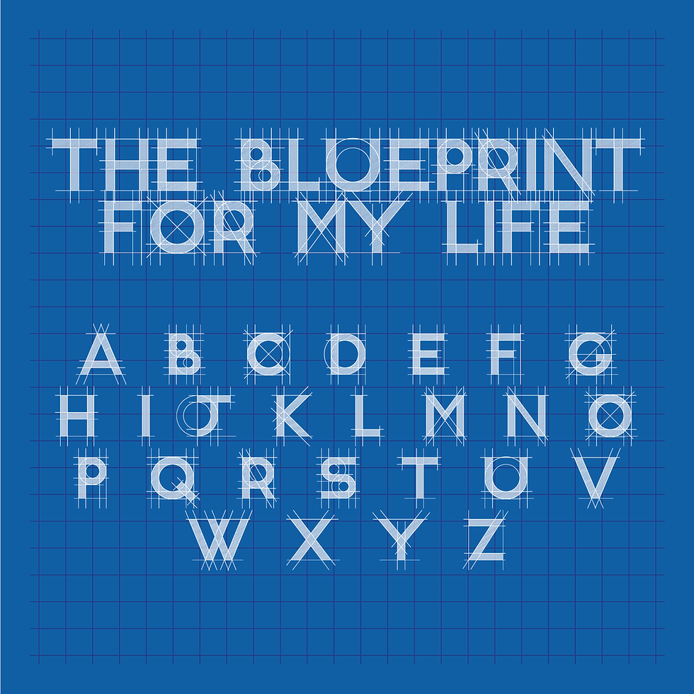
I was satisfied with my designs, confident they aligned with the inventory brief and reflected my identity. However, issues with the title, typeface, and charts needed addressing. I researched typefaces, seeking a bold, structured font with texture. My adapted Helvetica was too underdeveloped, so I switched to the R&C typeface, which combined a hand-drawn feel with structured guides, enhancing the title's presence. I plan to develop my own font version, blending elements from R&C and my adapted Helvetica, though this may occur later due to timing and deadlines.
Graph / Chart development
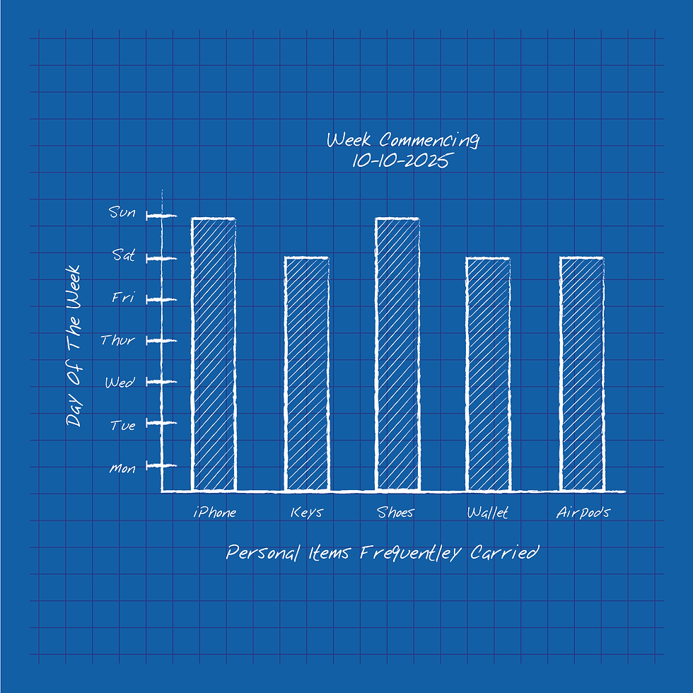
After creating a series of complex charts that effectively displayed my inventory, I realized these designs were somewhat overdeveloped and might not align with the style I intended for my A1 poster. To address this, I simplified the design and recreated my initial bar chart in a more straightforward hand-drawn form, which I later converted into a vector using Illustrator. I felt this approach better integrated with the overall design of my poster while still clearly conveying the data. My only concern now is whether it stands out enough, which I may evaluate after receiving feedback.
Additionally, I considered further developing this design using data I initially recorded in a journal. At the project's start, I documented the items I carried most frequently over three consecutive weeks and how often I used each item daily. I found this an interesting area to explore further, potentially examining why each item is significant in my daily life and what it reveals about me.
Final poster drafts
Having now narrowed down the rough layout I wanted to work with, I knew I would be working with a grid made up of three columns and six rows. This setup allows for optimal positioning of various elements in my design while clearly displaying a structure and hierarchy of importance for each item. For instance, the AirPods are larger at the top of the page, indicating they are the most important item in my daily inventory, gradually moving down to my wallet and keys, items that accompany me almost every day but hold a lower level of priority in my day-to-day life.
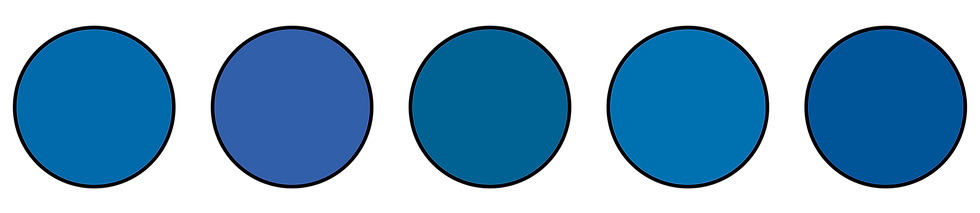
Another decision I made at this stage was to adjust the colours I was using. After printing out my initial drafts to present to the group, I encountered a few issues where the printed versions of my poster appeared too overexposed and more teal blue rather than a deep royal blue. This unfortunately caused the white sketches to be less visible and detracted from the authentic blueprint feel of the design. To counter this, I shifted the design to a deeper blue, allowing all the white details to stand out, and toned down the grid system in the background to a more navy blue. I was pleasantly surprised to find that this made the entire design stand out more, truly bringing the blueprint style together.
As I mentioned earlier, at this point, I have decided to use the R&C typefaces that I found on Dafont.com while researching typefaces that matched the blueprint theme. Although I initially started creating my own font, I discovered that the R&C typefaces already included all the elements I wanted to incorporate into my design, providing the overall poster with the rustic yet structured feel I was aiming for. To keep the typeface as unique as possible, I experimented with the height, width, and spacing to make the font feel more cohesive, as the initial spacing did not work as I had hoped. Adjusting the spacing and overall dynamics of the typeface helped fill the designated space and fit within my grid system more smoothly.

For the final section of my design, I decided to use the final hand-sketched vector of my graphs, which provides a detailed breakdown of why each item earned a place on my blueprint. I felt the graph added context regarding the regular occurrence of these items, accompanied by annotations next to each item explaining its significance in my life, why I carry it, its impact on my daily routine, and what it would mean not to have it with me. This is intended to clear up any confusion that had previously arisen about the inventory. I felt the design tied in well with the rest of the elements, and paired with my royal blue background, it stood out on its own.

Peer review & reflection
We had the opportunity to meet with the MA Design Communication group to review each other's work. This exchange provided valuable insights into how my work was perceived and whether it effectively communicated personal elements while adhering to the brief. Feedback was generally positive, highlighting a clear and consistent theme with a well-integrated title and design style. However, some annotations could be clearer, and the adjusted orientation, while eye-catching, made reading difficult. It was suggested that not adjusting the orientation might improve readability and visual appeal. Additionally, incorporating more blank spaces could better highlight vectors and annotations, enhancing the balance between a busy and organised blueprint feel.
Final A1 Poster
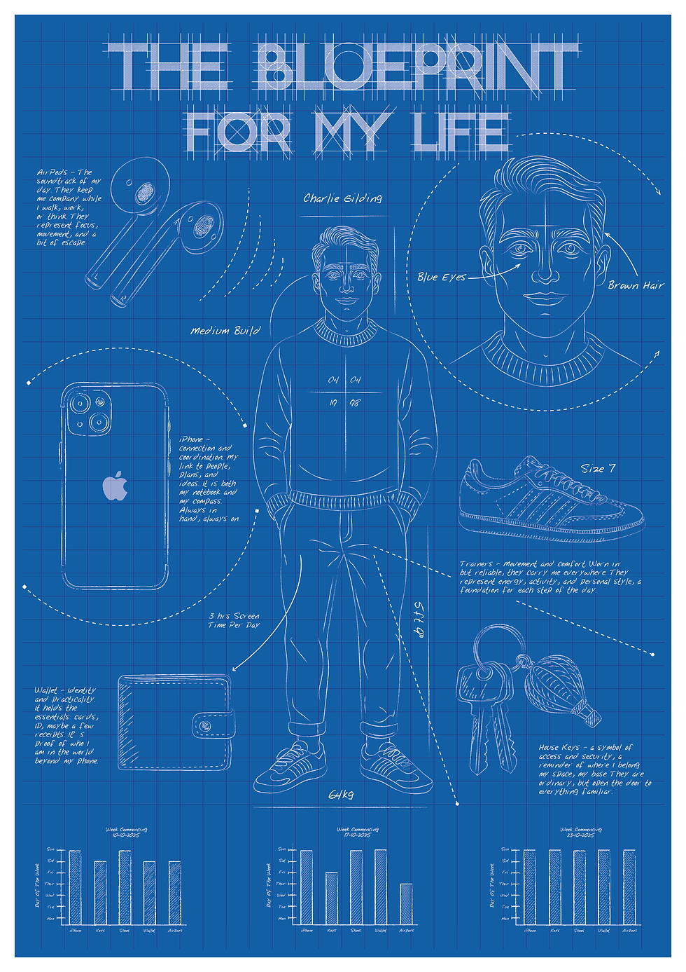
Overall, I was very pleased with the final result once my A1 poster was printed and displayed. After reviewing my final draft, I noticed a few minor details that needed adjustment, such as a couple of widows in the text paragraphs and correcting some spelling errors. However, these were small issues that did not affect the overall structure of the design and were easily fixed before submission. For printing, I chose a slightly heavier 200 gsm paper to give the piece more structure. Along with a matte finish, the design had a very clean appearance, resembling a poster while maintaining the feel of a blueprint.
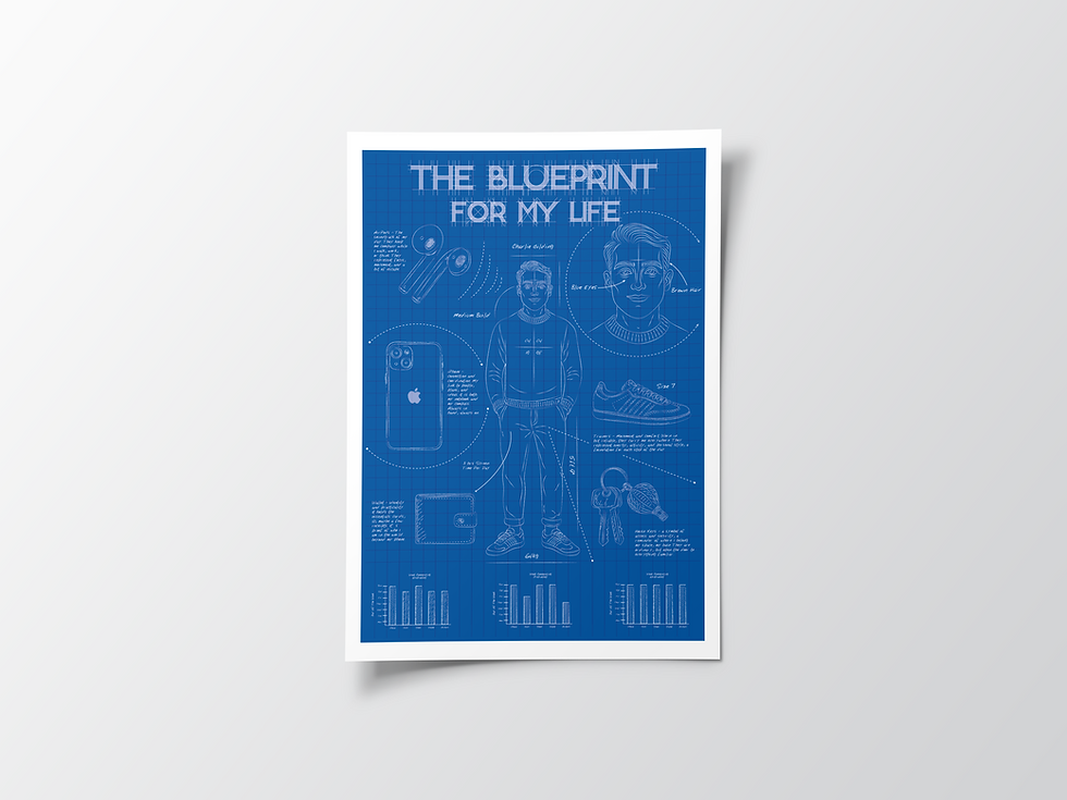
A few elements that I believe worked exceptionally well in this design were the illustrations. This isn't something I would typically include in a project like this, but I wanted to challenge myself by stepping out of my comfort zone and experimenting with the combination of text and illustration. I feel this approach truly brought the design together and provided the viewer with a more engaging glimpse into who I am. Overall, there isn't anything significant I would want to change if I were to redo the project. However, I think it would have been interesting to explore a few more different design styles, perhaps moving away from the blueprint concept and considering other ways to offer insight into my life.
Comments