Portfolio Project 2: Trajectory

Updated: May 19
Imagining Contemporary Practice in the Graphic Arts
Objective & Outcome
You are asked to consider your creative and critical journey; your influences and values; key discoveries and realisations; heroes or villains; foundations and aspirations. From this you will refine and create a 1 minute piece of motion design. It should be meaningful, but not exhaustive! It must also consider sound design – any voiceover, any sound or effects should be properly licensed, or even better, produced by yourself. It should include your name and a title (keep this simple, or incorporate it). Your development work and final outcome will need to be available online.
Understanding the brief
We are being asked to create a 1-minute motion design piece (video, animation, or motion graphics) that expresses our personal creative journey, our “trajectory.”
Essentially, I will be telling a visual story about:
How have I developed creatively (skills, mindset, influences),
What has shaped me (people, values, discoveries),
Where am I heading next?
It’s not about summarising my whole life, it’s about communicating one meaningful idea or feeling about our creative growth.
Self reflection | My creative trajectory
What key moments or experiences shaped me creatively?
Inspired from a young age by my grandfather, a sculptor and artist.
Fell in love with graffiti, the shapes, energy, and power of letters as images.
Started scanning my drawings into the computer, combining illustration and text, which led me toward graphic design.
Gained real-world experience designing posters and visuals for a nightclub.
Lost that job when the club burned down, then drifted from design during the pandemic.
Returning to university for my MA has helped me reconnect with design and reignite my creative drive.
What inspires me or drives me creativity?
The visual and emotional power of typography.
The raw, expressive nature of graffiti and street art.
The physicality and craft of print and editorial design.
Finding balance between artistic freedom and structured communication.
What have I learned about myself as a creative person?
My creativity is cyclical, it fades, shifts, and returns stronger.
I work best when combining expressive, handmade elements with clean design.
My creativity is most authentic when it feels personal and connected to my story.
Where do I hope my work or style will go next?
Develop a refined style that blends typography, illustration, and print.
Focus on tactile, story-driven design, especially in publishing or editorial work.
Continue exploring how art and design can coexist and inform one another.
Are there any metaphors or visuals that could represent my trajectory?
Spark reigniting | rediscovering my passion for design.
Letters evolving | from graffiti to refined type.
Line transforming | from sketch to structure.
Layers of print | each stage leaving its mark.
After Effects | Initial experimentation with Motion Graphics
Initially, learning how to use After Effects was challenging for me. Having previously used Adobe Premiere Pro to create some stop motion pieces, After Effects was completely new territory for me. However, after completing two After Effects sessions with the MA Design Communication group, I found the concept extremely interesting and had already decided early on that this is something I would potentially like to incorporate into my final design
At this stage, my After Effects skills were quite basic and undeveloped, but my primary focus was on understanding the essential elements and brainstorming how to animate words and shapes on screen. Although this turned out to be more complicated than I had expected, I felt I was starting to comprehend the basic functions and briefly explored the 12 principles of animation. I found this particularly intriguing as it delves deeper into how objects move on screen. I'm not entirely certain if I will incorporate illustration into my work, but I found it beneficial to have a fundamental understanding since I believe these principles can also be applied to how text and typography move on screen, making the images feel less static and rigid, essentially bringing the entire design to life beyond just words moving on a screen.
What is Motion Graphics? 'MOWE Studios'
'Motion graphics means graphics in movement. It’s the most straightforward definition possible. Oftentimes, motion graphics is also called motion design, making the relationship between movement and design elements easier to understand. Motion graphics is about bringing design knowledge to new mediums by adding the elements of time and space — thereby creating movement'.
'Motion graphics means graphics in movement. It’s the most straightforward definition possible. Oftentimes, motion graphics is also called motion design, making the relationship between movement and design elements easier to understand. Motion graphics is about bringing design knowledge to new mediums by adding the elements of time and space — thereby creating movement'.
'But bringing design elements to life isn’t a simple task. Unlike other animation fields, you don’t have a pre-defined or “natural” way of animating things or objectsMotion graphics means graphics in movement. It’s the most straightforward definition possible. Oftentimes, motion graphics is also called motion design, making the relationship between movement and design elements easier to understand. Motion graphics is about bringing design knowledge to new mediums by adding the elements of time and space — thereby creating movement'.
'But bringing design elements to life isn’t a simple task. Unlike other animation fields, you don’t have a pre-defined or “natural” way of animating things or objects'.
After Effects | Experimentation
As I continue to develop my skills in Adobe After Effects, I started exploring ways to create my own title sequence. By studying designers like Saul and Elaine Bass, I discovered intriguing concepts for animating text on screen. However, my primary inspiration came from frame transitions, whether through moving text on and off the screen or using shapes to transition between screens. Although my After Effects skills are still quite basic, I have utilised YouTube tutorials to learn new features, such as auto trace, to bring my text to life.
Title sequence research | Saul & Elaine Bass
In exploring motion graphics and their application in longer works, I examined the contributions of Saul & Elaine Bass and their use of motion graphics in crafting title sequences. What I truly appreciated about their work was their use of transitions not merely as simple cuts or fades, but as narrative devices. Each transition enhances mood, theme, or character psychology. Rather than serving as mere decorative movement, transitions function as visual punctuation. This is an approach I am eager to incorporate into my work as I aim to develop motion graphics that effectively convey the narrative I wish to tell.
Understanding structure & narrative | Design in Motion: Applying Design Principles to Filmmaking
While planning the structure of my piece on motion graphics, I explored several chapters from "Design in Motion: Applying Design Principles to Filmmaking." I primarily focused on the concepts of narrative and film structure. Before creating my own storyboards and putting my ideas on paper, I wanted a general idea of the structure my design would take. Already familiar with the three-act model, I aimed to explore whether this was the only way to structure a film or if there were adaptations that might enhance my design in terms of communicating my ideas to an audience. Although this reading didn't help me find alternative formats as I initially intended, it did deepen my understanding of how the three-act model could engage my audience and keep my design interesting and captivating.
While considering the direction my design narrative will take, I found the following five points incredibly useful for deciding what to include and what to omit. Working within a brief time frame of just one minute, I now understand that every element must be carefully considered. This approach will help my audience engage with the design and feel more connected to my journey.
'A story should have a beginning, a middle and an end, but not necessarily in that order' (Jean-Luc Godard).
1. Engage the audience; make them work.The passive action of watching can be made more active if you don’t patronise your viewer. Don’t just feed them the information, make them work to understand it; really engage them and keep them on their toes.
2. Your time is limited. No doubt there are numerous scientific studies that prove the following observation and some that are contrary, but I have found that the first minute is crucial; actually, the first twenty seconds can be critical. After twenty seconds if your audience is not absorbed, they will switch off or drift away. Believe me I’ve done it, especially viewing showreels. Sometimes ten seconds is all it takes for boredom to set in, especially if you have hundreds to look through. You may well never get a second chance to make a first impression. The end of your film is also important, according to the 48FILM project, when writing your script, plan on a powerful opening, a meaningful middle and a satisfying end.
3. Is the story worth telling or retelling? Is it written or rewritten in a fresh, original, meaningful, enlightening, and relevant manner? Or, at the very least, is the story compelling and memorably entertaining?Otherwise, why bother making the film at all, let alone subject anyone else to having to sit through it? Is your story revealed in an engaging, moving, cinematic and active way.If so, could it be described as boring, linear, passive, mundane and merely expository?
4. Mind your budget. If your access to resources is limited, think minimal. You don’t want your no-to-low budget struggle screaming out from every frame. Worst can be poor performance from substandard, wanna-be actor friends. Sorry, but let’s be brutal – they won’t thank you. However, don’t assume that a no-to-low budget is a disadvantaged place to start from. An urban myth once reported the BBC would frequently halve budgets to increase creativity. True or not, it’s an interesting proposition.
5. Show emotion. Have you encouraged the audience to get emotionally involved with the main characters and their stories? Can they identify, care about, or at the very least be interested, engaged or entertained by them? In the case of documentary, this can be brought out through the choice of dialogue, drawn from the questions you ask and the selections you edit together from their answers. If it is a fictional narrative, the emotional engagement might spring from a specific technique, as is evident in the film Victoria (Figure 3.6).
Hilton, P.E.N.N.Y. (2020) Design in Motion: Applying Design Principles to Filmmaking [online]. 1st ed. London: Bloomsbury Academic. [Accessed 12 December 2025].
Concept development
While reflecting on my design journey, I aimed to concentrate on a few key factors that have influenced me throughout my life. To narrow it down, I examined where I began and who influenced me, before delving into my personal design style, how I started, and what my development looked like to ultimately lead me to where I am now.
Concept 1 | My feelings towards design
For my first concept, I explored a more emotional journey through my experience with design and what has physically brought me to where I am today. Pursuing an MA in Design Communication is something I never imagined I would be doing, five or even ten years ago. However, my feelings and life experiences have led me here. With my grandfather being an artist/sculptor, I was raised in a creative environment from an early age, sparking a passion within me that I nurtured as I followed my own path. This journey began with studying fine arts in college, eventually leading me to pursue a BA in graphic design. Over the years, I focused more on fitting into a category rather than staying true to my passions and creativity, which ultimately led to my creative spark fading for a time. This is something I have reintroduced myself to, and I have now reignited my creative passion and rediscovered my love for design.
Concept 2 | From graffiti to print design
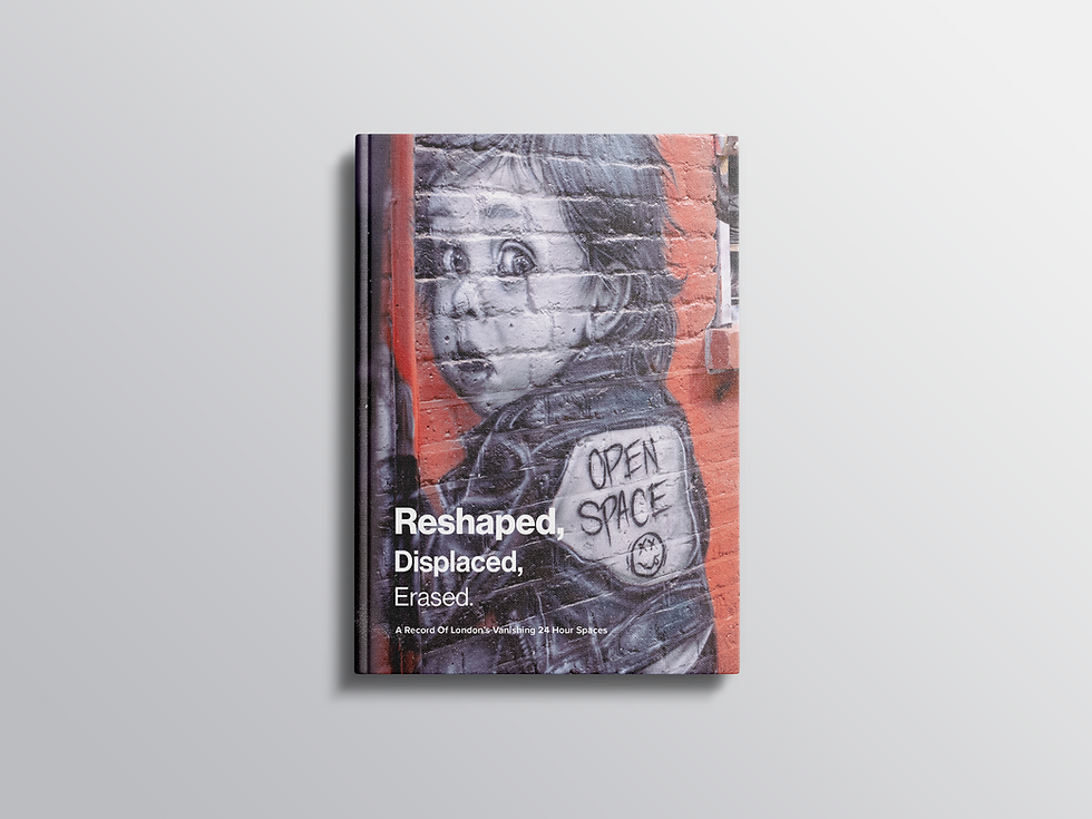
My second concept offers a more literal exploration of my creative journey in design, highlighting my beginnings with a passion for graffiti art. From a young age, I was captivated by graffiti, the styles, colours, and the impact it could have on an urban environment. This fascination was one of the reasons I was drawn to establishing myself in Bristol. Building on my interest in graffiti art, I envisioned each scene transitioning into a different stage of my design interests, initially evolving from an urban, vibrant graffiti-style text to a more structured grid with well- organised text. Eventually, it progresses into a Bauhaus-inspired scene featuring bold geometric shapes and angles, with toned-down colours that are more impactful than before. I have always considered Bauhaus to have a significant influence on my experiences with graphic design, being the first real design movement I encountered, and I often draw inspiration from this style in my work. The scenes would then progress to demonstrate how I applied my skills in real-world design, such as books and posters, focusing on more physical printed elements, which is where my interest in graphic design lies today.
Concept 3 | My journey through design
While my final concept is quite similar to concept 2 two, it emphasises a slightly more typographic narrative. It generally follows the same stages, starting with my early passion for graffiti art, transitioning into my discovery of graphic design, and ultimately culminating in a printed typographical poster design. The main difference here is the idea of a flowing line, symbolising the journey I've undertaken. This line weaves through each scene, looping and swirling to create a different image in each one before eventually returning to the original line, continuing its journey of discovery and exploring more of the design world. I am particularly fond of this concept because the line's ongoing journey of discovery resonates with me. In a way, I will never be finished with my journey through design, and the line will eventually form new scenes and expand based on my future influences.
Kinetic typography research | 'The what, why, and how'
'Kinetic typography is an animation technique that integrates motion with text, which is why it’s also sometimes known as motion typography. There’s no fixed way in which the text should be animated, and the lettering can shrink or expand, move around the page, change color, undergo distortion, or be subject to any creative techniques that a graphic designer wants to use'.
'Manipulating and transforming text with movement can achieve a wide variety of effects, it can create emphasis where it is desired, convey emotion, conjure up ideas, and transform simple text into a powerful message'.
While delving into motion graphics, I wanted to explore the idea of developing my work further through kinetic typography, highlighting text movement through transitions, and ensuring my ideas remained grounded in graphic design rather than other forms. Ben Banhart shared some interesting starting points to consider on his blog Linearity, showing that there is no fixed way in how we should be animating text yet through simple motions we can sometimes achieve a more powerful message.
Design styles | Bauhaus
To ensure my motion graphics piece remains connected to my personal journey, I wanted its overall design to reflect the main inspirations of my design style. Reflecting on the key stages of my design career, one studio stood out: Bauhaus. While studying Graphic Design in college, Bauhaus was the first design firm I discovered. From the beginning, I was captivated by the concept of Form Follows Function. The use of clean lines, geometric shapes, and uncluttered aesthetics really attracted me, and I have consistently incorporated these elements into my work over the years.
Design styles | Malika Favre
Malika Favre was one of the most influential designers I studied early in my design journey. Her bold, vibrant colours and minimalist style with maximum impact have greatly inspired me. Over time, I have drawn a lot from Favre's work, both from a graphic design perspective and later when incorporating illustration into my projects. For this particular project, I aimed to integrate Favre's use of colour, knowing I wanted to heavily utilise typography and shapes to achieve maximum impact in my final piece of motion graphics.
'Her skill lies in the art of simplifying down an image to its bear essentials and making it pop! Malika concentrates on light: almost drawing with shadows. Dark as that sounds, her work is actually some of the brightest out there in terms of use of colour'.
Handsome Frank Illustration Agency. (2018). Malika Favre — Handsome Frank Illustration Agency. [online] Available at: https://www.handsomefrank.com/illustrators/malika-favre.
Initial development | My journey through design
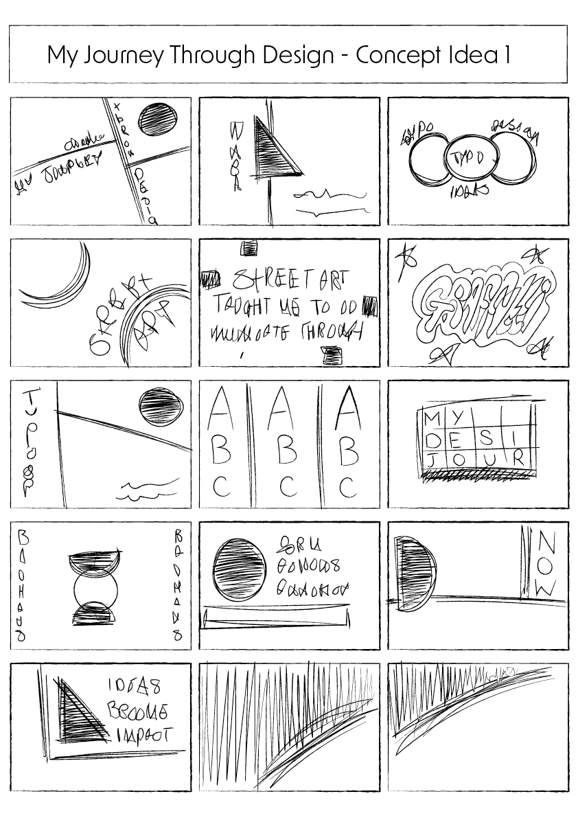
Initially, I was particularly interested in creating a 1-minute motion graphics piece that reflects my personal growth through design. As a designer, I often incorporate geometric shapes, vibrant colours, and combined typography. Exploring how I arrived at this point seemed like an intriguing journey. It all began with my introduction to design by my grandfather through sculpture and fine art. Taking this in my own direction, I developed a keen interest in graffiti and street art, which I extensively experimented with during my younger years. I explored how text and words can convey a wide range of emotions, thoughts, and messages. To this day, I continue to use words to express messages, thoughts, and emotions, albeit in a more socially acceptable manner. This transition is what I aimed to convey through this concept.
After creating an initial draft of my ideas, I presented it to the MA Design Communication group for an initial critique and further development. Upon presenting my initial ideas, the general feedback was that the concept could be interesting to explore but seemed vague and needed more direction. How can I make this more focused would be my next step in development.
Preliminary research into music | Jazz
Initially, I've been contemplating using Jazz as the soundtrack for my motion graphic because of its expressive, dynamic, and improvisational nature. Jazz, as a genre, is often linked to creativity, optimism, and movement, which aligns with the essence I want to convey in my design. My initial thoughts are that the fluid rhythms and variations could complement the motion design and assist me in pacing the animation, making the visuals feel more organic and expressive rather than overly rigid.
An early challenge I wish to avoid is selecting a lesser-known piece for my work. I believe music is deeply personal to many, with each person associating different feelings with a song. Many may even connect emotions and past experiences with music. I aim to prevent this, as I want viewers of my design to approach it with an open mind, free from any preconceived thoughts, emotions, or feelings tied to an element of my design. I hope this approach will assist me later in the module when considering the message I'm conveying and encouraging the audience to fully embrace my trajectory.
Nu-Jazz
Nu-jazz is a contemporary evolution of jazz that blends its improvisational spirit with modern electronic, hip-hop, funk, soul, and ambient influences. Rather than focusing strictly on traditional swing or bebop structures, nu-jazz embraces synthetic textures, looping rhythms, and experimental sound design while still honouring jazz’s harmonic complexity and freedom. It often feels urban and forward-thinking.
Nu-Jazz seemed to align much better with what I aimed to represent in my work. Its slightly more modern and forward-thinking style appeared to reflect the journey I've experienced and the approach I usually take in design. This is something I plan to explore further as the project progresses. Initially, I felt this was an idea I wanted to pursue, but it was challenging to be certain without seeing it in action alongside a piece of motion graphics.
Preliminary research | Sound Effects
Initially, my research approached this aspect superficially, with the belief that music alone could bring my design to life. However, upon delving into title sequences, particularly the work of Saul and Elaine Bass, I discovered that their use of sound extended beyond just music. I observed that, although subtle and not immediately noticeable, sound effects played a significant role in almost all pieces of motion design, enhancing and truly bringing everything to life.
As I move to the next stage of my process, which involves creating an animatic to visualise how my ideas translate onto the screen, I wanted to consider this aspect early on. I observed in many research examples that motion graphics were generally well-timed with music and sound effects, so I aimed to incorporate this from the beginning. My reasoning was that it would prevent the need for restructuring my designs later, which could be more challenging. At this stage, I considered using sound effects like computer keyboard typing, spray paint, and general electronic computer noises. I found numerous examples on BBC Sound Effects, which offered high-quality sounds for free. I also explored the free sound effects available in Premiere Pro, which worked well; however, the free versions were generally very short and didn’t integrate as effectively into my animatic. I plan to explore this further in the project, with initial thoughts on producing these sound effects myself.
How my ideas translate into motion graphics |
Initial experimentation
As I sought to further develop my initial concept, I wanted to explore ways to make it less vague and provide more context. The foundation of my story is to offer insight into myself as a designer, highlighting what inspired me and influenced my work and design approach. At this stage, viewing this motion graphic piece more like a story could be beneficial. It would begin by examining my main influences, followed by a breakdown of what each taught me, and conclude with what I have taken away and developed into my own style.
Typography exploration
Recognising that typography would play a significant role in my motion graphics piece, I aimed for this element to truly capture the essence of one of my key design inspirations. I resonated with the structured forms and functionality typical of the Bauhaus movement, which captivated me early in my career. Bauhaus's approach of rejecting decorative, traditional type and using typography as a communication tool, rather than for embellishment, was particularly influential. With this in mind, I chose to work with the four typefaces: CarlMarx, Dunbar Tall, Noka, and Joschmi. These typefaces seemed decorative enough to keep the design engaging without complicating the scene. Ensuring legibility was crucial, so that if I opted not to use a voice-over in my final piece, the viewer could follow the narrative scene by scene. Although I experimented with incorporating my own handwriting in each scene during my animatic, I found that while it added a personal visual element, it didn't quite fit into the piece or reflect my design journey effectively.
Title sequence research | Daniel Kleinman
In Daniel Kleinman's James Bond title sequences, object-driven transitions are frequently employed, where a single visual element transforms, expands, or redefines itself to seamlessly guide the viewer from one scene to the next. Rather than using abrupt cuts, Kleinman allows shapes like gun-barrel forms, silhouettes, lights, or weapon motifs to smoothly morph into new settings, establishing a continuous visual evolution.
I found this concept incredibly intriguing and was eager to explore how I could incorporate it into my work. Utilising a constant element that evolves over time to create the next scene seemed like an engaging method to maintain the flow of motion graphics without resorting to more stereotypical transitions like sweeps or curtains.
First draft | 10 second introduction
This is my initial draft of what my motion graphics piece will look like, with a design that emphasises transitions and kinetic typography over other animations. Since this is my first experience with After Effects and motion graphics, I wanted to concentrate on mastering what I have learned, rather than being overly ambitious and creating something more complex but of lower quality. At this stage, I particularly liked the concept of using an on-screen object to transition into the next scene. My use of the blue square, which enlarges to lead us into the next scene, is an element I plan to incorporate to ensure a more seamless flow throughout the video.
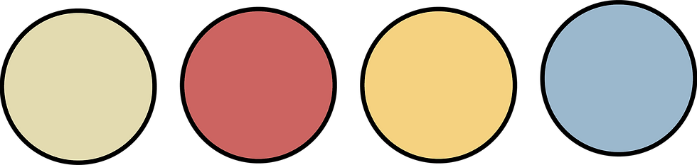
While developing my introduction scene, I found it a great opportunity to experiment with colour, which I would later incorporate into my work. Having already decided to represent many of my influences within the motion design piece, I thought it was fitting to once again reflect some of these influences. During my bachelor's studies, I explored the work of Malika Favre and was always drawn to the bright, vibrant colours used in her work. Her ability to keep designs simple and minimalist yet eye-catching and punchy resonated with me, demonstrating how even the simplest colours and shapes can be manipulated to tell an interesting story or narrative. I chose a range of simple colours, beige, red, yellow, and blue, and decided to tone them down to pastel shades to reflect my personal taste. I felt that this would nicely complement the bold geometric shapes I was already experimenting with.
One final aspect I wanted to develop in preparation for advancing with my motion graphic is incorporating an illustrated element alongside using pre-made fonts. Illustration, in various forms, has always been something I've enjoyed and has played a significant role in my creative journey. Finding ways to express emotions or feelings through elements was something I found really intriguing when I first explored street art and graffiti. This was also the first time I tried my hand at illustrating text and experimenting with different forms. Although these designs don't necessarily align with the intended theme, this is intentional, as it was an experimental phase for me. I want this to clearly show the stark contrast between where I started and where I am now in terms of design.
Concept development | Storyboards
Further development of my storyboards. At this stage, I focused on the story I was telling, reflecting on where I started and where I am now. Drawing inspiration from Bauhaus, I used strong geometric shapes and a simple colour palette, which I felt was a solid foundation for determining how the objects would move on screen. By mapping out my designs in a more refined style, I began to understand what worked and what didn't. Initially, the storyboard on the left seemed well-developed; however, I realised that these scenes might be too short to fill the entire minute for my stop motion, necessitating a lot of movement in each scene or the video would be cut short. There was also the issue of supporting text. Although I had considered using a voice-over, I hadn't started developing it yet, so I wanted a physical narrative more present in the video. This way, even without sound, viewers could still follow along, which I believe is crucial in design work to make it accessible to as many people as possible.
Sound Introduction
When considering the introduction of sound into my work, I had a few initial ideas in mind. Having already created an animatic for my initial concept, I attempted to add background music. I actually liked this as an initial test; however, the timings were completely off, making the overall sound feel somewhat empty and not well connected to the piece. Despite this, I appreciated the tone and vibe of the selected music. The overall feel of my motion graphic was intended to be quick and upbeat, which the sound needed to complement without detracting from the rest of the design.
After experimenting with a few different pieces of music, I decided to proceed with 'All That' by Benjamin Tissot, sourced from Bensound [License code: MAGAVLUAFBWNKKJL]. Initially, I considered more rock/pop pieces for development, but they didn't achieve the desired effect and generally made the entire piece feel chaotic, which was not what I intended. Using a jazz-focused piece like 'All That' provided a more relaxed, upbeat vibe that complemented the piece well. I also noticed that this specific piece of music emphasised the bass drops, which I thought, if timed correctly, could significantly enhance scene changes and transitions. The timing of these elements would be something to consider when building my final scenes in After Effects.
First draft | 1 minute motion graphic
Composition: After creating the first draft of my 1-minute motion graphics piece, I felt very pleased with the result. One aspect that was particularly successful at this stage was the transitions between scenes. Early on, I decided to focus more on the transitions between elements, and I believe I executed this effectively. In most cases, there was always an element in each scene that transitioned into the next, maintaining a seamless flow and making the entire piece feel like one continuous motion.
Animations: Despite this, certain aspects definitely needed improvement at this stage. Some animated objects, like the circles in scene four, could benefit from enhancements to improve their flow. The main issue was with one of the circles entering from above and bouncing off the bottom of the screen before expanding. Although the overall scene worked really well, I feel that my execution of this in After Effects could have been smoother. This is definitely something I would consider addressing in the future.
Design style: At this stage, I was extremely pleased with the design styles. I felt that I successfully captured all the creative inspirations that have influenced me in various ways. The bold geometric shapes from Bauhaus and the minimalistic yet captivating colour palette inspired by Malika Favre were well-represented. I also incorporated a few hand-drawn illustrations in scene six, highlighting the impact of graffiti art on my design journey. While I felt all the elements worked well, I did have a concern that the design might seem a bit underdeveloped. Although minimalism was my intended and achieved goal, I wanted to explore whether there were scenes that could benefit from added depth, or if such additions were even necessary.
Sound: Although sound was something I had considered from the very beginning of the project, I feel it was still in the early stages of development here. I was fairly confident that 'All That' by Ben Tissount suited the general tone of the video, and I managed to synchronise scene transitions with bass drops, adding overall flow to the piece. However, the background sound effects were something I wanted to further develop, most likely even create myself. At this point, I was using a few effects from BBC Sound Effects, such as a typewriter, spray paint, and coding sounds, to add a bit more realism to the on-screen actions. While words were being typed out letter by letter, I layered in the sound of a typewriter, which I felt worked really well. Similarly, a spray paint sound effect was applied as graffiti-style vectors appeared in scene six. My next step to enhance this would be to record these sounds myself, something I felt would be quite achievable and would add a new layer of depth to the sound being used.
Reworking my initial design
After sharing my first draft with the MA Design communications group, I received additional feedback to consider. Alongside my personal reflection, the initial response to my motion graphic was generally positive, although a few issues were noted. The main point was that, while the overall story was effective and conveyed my intended message, there were some contradictions in certain scenes. My goal was for the piece to illustrate my journey through design, with each scene showing how my key influences have shaped my work into its unique style. However, some viewers of my draft misunderstood this, thinking the design style of the video was meant to directly mirror each of my influences. One person pointed out that it was atypical of Bauhaus to mix different fonts within the same composition, which didn’t align with their understanding of "form follows function." although not something I agreed with, to avoid confusion, I decided to reduce my use of multiple fonts in this design. Although this is typical of my style, I felt it would prevent misunderstandings going forward.
Another aspect I wanted to address early on was enhancing the overall visual style. While I was quite satisfied with the composition, the feedback indicated that the design didn’t feel authentic, which I wanted to improve. Although I had previously added textures to each scene using noise and grain effects, I decided to go further by creating my own water colour shapes and backgrounds, which could be scanned and digitally adjusted in Illustrator before being reintroduced into After Effects. This approach seemed effective, but after reconstructing a second draft, it was clear that further work was needed.
Sound development | 1920's Jazz
Following my latest session with the MA design communications group, a particular piece of feedback resonated with me. One member felt that the music didn't align with the design or the aesthetic I intended to convey, suggesting that a 1920s-style jazz song would be more appropriate. They believed it would complement my references to Bauhaus and the emergence of Jazz during that period. Although this wasn't the effect I aimed for, as I chose Nu-Jazz to reflect my personal trajectory, I found the idea intriguing and worth exploring to see if it could enhance the design. Initially, I'm hesitant because my early decisions about sound were crucial for pacing and structuring my video. Changing the song at this stage would generally require starting the design from scratch. However, I believe this exploration will be an important part of my development, potentially confirming that my initial sound choice was effective or revealing new possibilities.
Second draft | 1 minute motion graphic
When revising my one-minute motion graphics piece, I concentrated on the key elements highlighted during group sessions with the MA design communications cohort. This led to a design that generally worked but felt somewhat underdeveloped in certain areas. To enhance the design, I reworked some initial compositions and experimented with adding details around existing shapes, combined with the use of trim paths. This approach seemed to enliven the design and added much-needed depth. In some sections, I had previously experimented with different angles and orientations, creating contrast among the geometric shapes. I wondered if this made the designs overly complex, so in this draft, I straightened the geometric shapes to achieve a cleaner visual image. I actually liked this look and considered applying it more broadly in future drafts I plan to develop.
With no more sessions planned with the remaining MA design communications cohort, I had no further opportunities to receive feedback from my peers on the design. This was somewhat challenging, as I had heavily relied on peer feedback to understand whether my design was being communicated clearly. However, this did not hinder my development; instead, I saw it as a chance to gain feedback from individuals outside the course. Presenting my designs to people outside the design communications group provided me with a much deeper insight into how my designs were perceived at this stage. The design communications cohort had generally seen the development of my designs, so they subconsciously had a clear understanding of what I was trying to communicate through my one-minute motion graphics, regardless of whether this was evident in the design. When I showed my design to others, the general consensus was that the message behind my motion graphic piece was well understood and demonstrated a clear development from my initial starting point as a designer, highlighting the key skills I have carried into my work. One takeaway at this stage was some confusion regarding my inclusion of Bauhaus and "form follows function" as a caption in the design. I had been considering removing this, as I questioned whether it truly fit within the design.
The last insight I gathered from further feedback is that earlier versions of my design, along with the brighter and more vibrant colour palette, seemed to stand out more and were more effective for the design. I plan to incorporate this into my next draft, as I also felt that my watercolour inspired background appeared more authentic. It didn't quite align with the tone I aimed to convey, which was a more upbeat and positive journey.
Final Draft | My Summary & Key Takeaways
My one minute motion graphic can also be viewed on Vimeo | https://vimeo.com/1152268435?share=copy&fl=sv&fe=ci
Having now developed the final draft for my one minute piece of motion graphics I have come away with a design that although I am not 100% happy with I do feel clearly communicates my journey through design and clearly reflects the trajectory of where I started as a designer and where I am now, including my inspirations the lessons that I have learnt and how I incorporate this into my work as a designer in the present day.
In the final draft of my design, I returned to a simpler theme, opting for a vibrant yet straightforward colour palette and a minimalistic use of shapes. This choice, which closely resembles my initial style, was driven by my personal preference for the visual aesthetics that best represent my design journey. I aimed for this to be evident in all visual elements, complementing the narrative conveyed on screen. Having had a generally positive experience in design, I wanted this to be mirrored in the bright, vibrant colors, which I felt were not adequately expressed in the more subdued tones of my earlier drafts. This approach also highlights my development, subtly acknowledging how I've honed my skills over time.
Regarding animation and movement, I decided early on to prioritise transitions over creating an overly complex video that lacked flow. I am quite pleased with the execution, as I feel my video maintains a consistent flow from start to finish, adhering to the theme of featuring a single element in each scene that transitions to the next. While I experimented with scale and motion in After Effects, I primarily used pre-programmed effects like typewriter and flutter for the on-screen text. Although I tested various effects, these two aligned well with the design's theme, ensuring everything remained connected, moving, and fluid.
One of the challenges I encountered during this project was definitely fitting everything I wanted to communicate into a 1-minute timeframe, something I had identified earlier in the project. With so many ideas, it was difficult to decide how to convey my message in so few words, determining what was essential to keep and what could be removed without losing too much of the story. This was an interesting phase of the process and certainly one of the most challenging parts. I believe I reached a point where it worked well, though there were moments when the compositions felt a bit rushed. In hindsight, if I had more time, I would have explored this further to see if any compositions could have been removed to allow for slightly slower or longer frames.
A few final adjustments to my design mainly concentrated on sound and how it ultimately began to unify my design. In my initial draft, I was quite satisfied with my sound choice. However, the module lead raised concerns, suggesting it didn't align with the design's tone and seemed too modern for the context. I experimented with this a bit, using an older jazz song in one of my revised designs, which was an intriguing idea as it allowed me to reflect and experiment with different sounds and their impact on my design. However, I decided not to pursue this. While I appreciated the feedback I received, I felt that this concept didn't truly fit within the design and didn't align with the emotional journey I aimed to convey. For this reason, I chose to return to my original piece of sound, which I generally felt imparted a more upbeat and positive vibe to the project. Paired with the more vibrant colour palette, I felt this combination worked much better.
Unfortunately, stepping out of my comfort zone with a motion graphic project led me to overly consider the feedback and personal opinions on the design during group critiques, which left me feeling a bit deflated. As a result, my design in many ways didn't reflect my true style or what I personally liked and believed worked. In the future, I will definitely keep in mind that while feedback from peers is generally important for progressing and developing my designs to the best of my ability, I need to filter out what doesn't resonate with me and in a way, disregard others' likes and dislikes of my work.
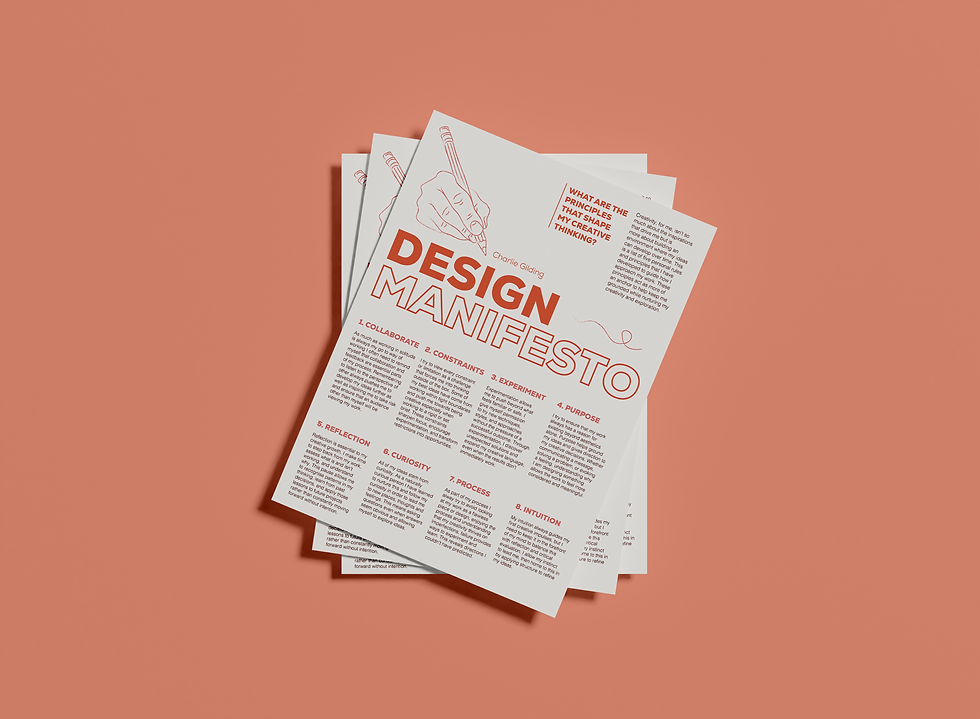
However, this being said there were still many aspects that I felt worked well throughout my project. I generally believed that the message behind my motion graphic was effectively communicated, and there was a clear story depicting the evolution of my design journey. It showed where I began, some of the main inspirations that influenced my design approach, and finally, the key principles I have adopted and strive to follow in all aspects of my work. I found this project extremely interesting; it challenged me in many ways to step outside my comfort zone and try something in which I had little to no experience. Although the design may not have taken shape exactly as I envisioned, I am proud of the work I produced and have developed my skills in software such as Adobe After Effects and Premiere, two programs I had not encountered before this module.

Comments